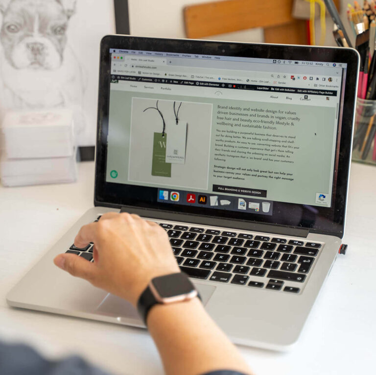
The first time I built the Elm Leaf Studio website was only last year, however it was created quickly with the focus on being to get to work and not spend ages working on my own website. There wasn’t especially anything wrong with it but I knew I could do better than I had. I knew that there was a better page builder/theme than using Elementor and a theme from Themeforest. My main aim was to improve speed, web page carbon footprint and accessibility. But I also wanted to showcase my skills better too.
It gave me the chance to look critically at my own website as a whole, not just thinking of making little tweaks here and there. Now I didn’t throw out what I had done previously completely the base was there to work from and improve upon. I also imported a lot of my previous content such as posts, page and images! Which is important for SEO purposes as rebuilding a website can cause a slight hit to SEO especially if you aren’t careful with keeping the current pages or adding redirects.
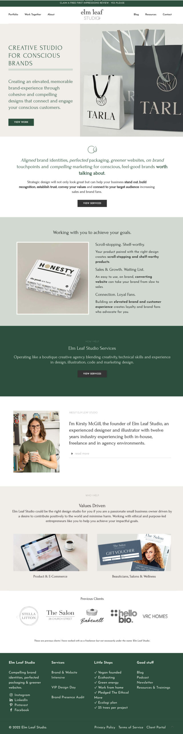
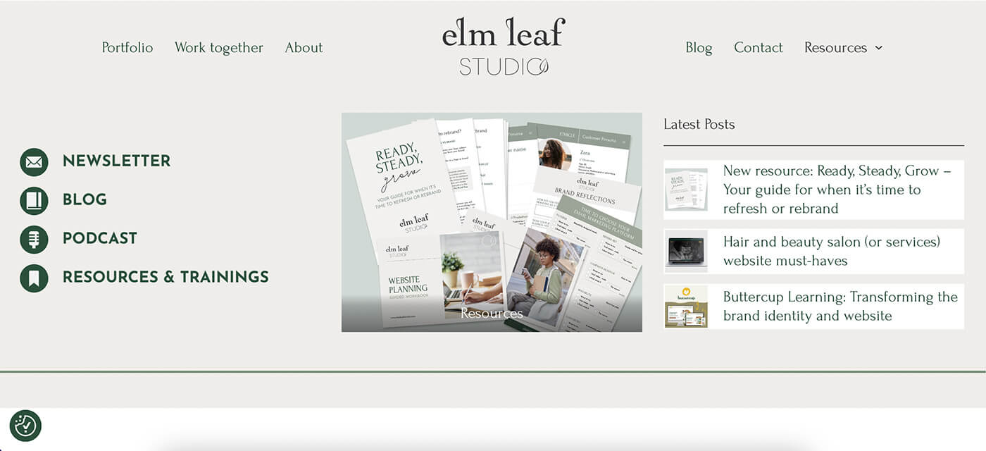
I’m sure I took some before screenshots but can I find them – no! So I’ve used waybackmachine to show an indication of what it looked like before the redesign and rebuild vs after and I found an earlier version too so you can see the evolution of the homepage design.
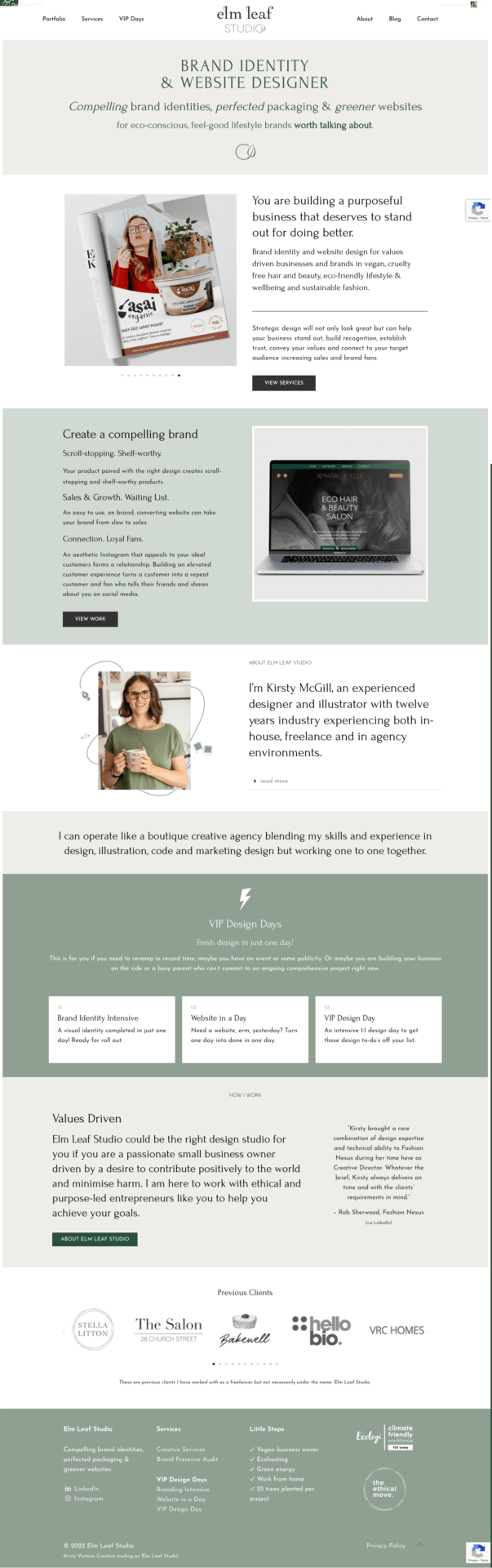
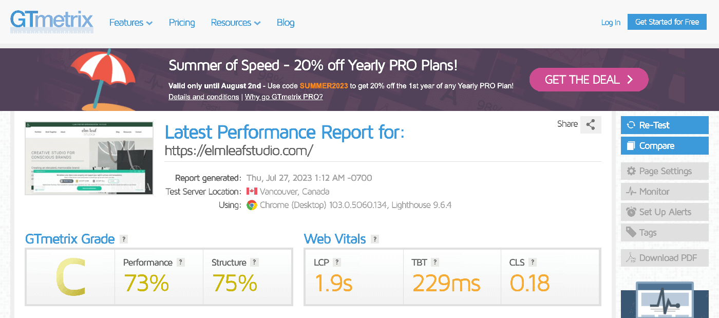
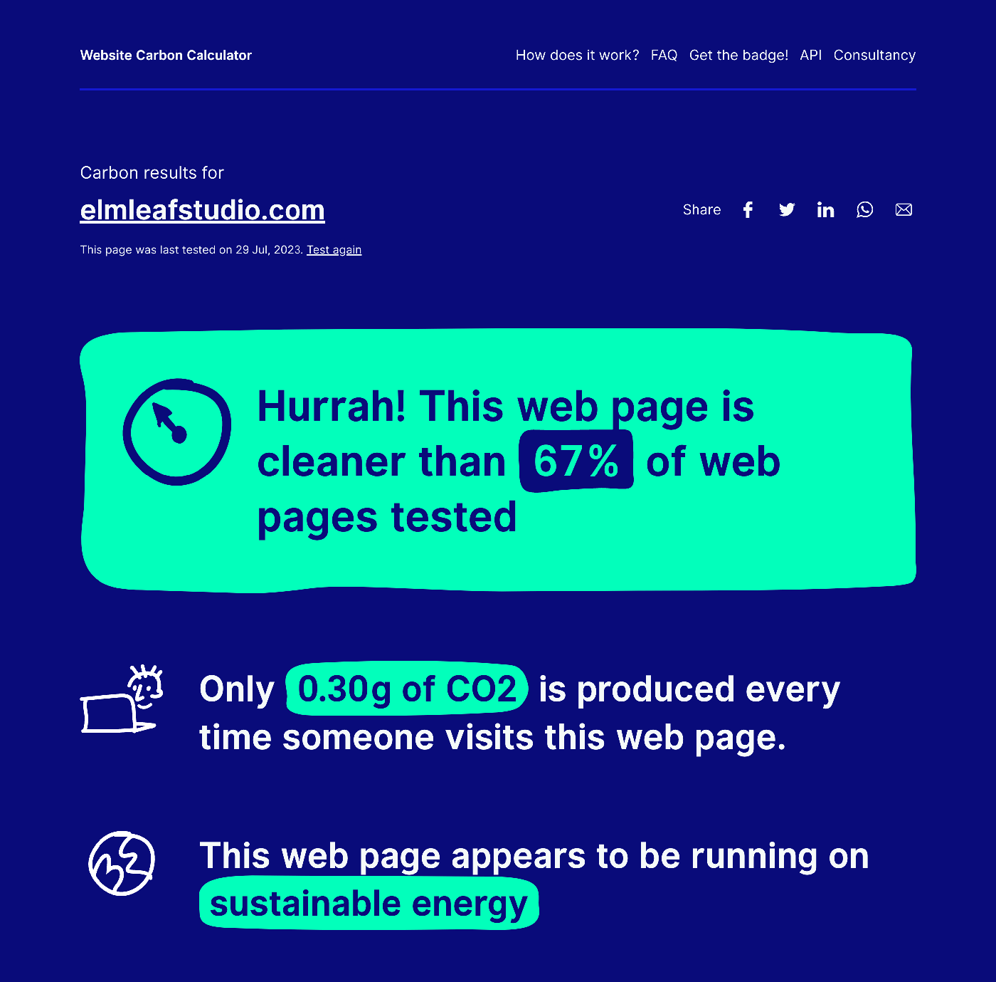
Before – benchmarking metrics
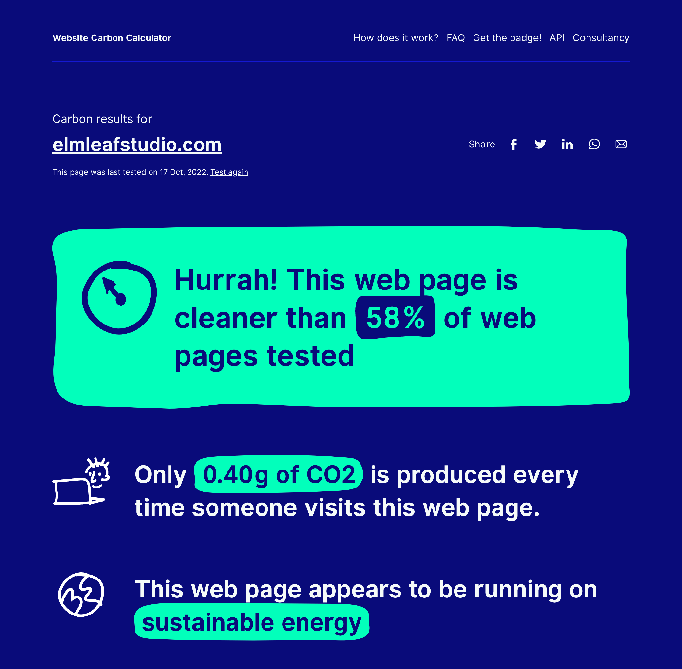
Tests of my homepage run on a number of sites that help check these metrics to benchmark, websitecarbon calculator showed 0.4g of CO2 every visit, GT Metrix was grading the performance as a C / 73% and Google Page Speed Insights 81 for performance and 77 for accessibility.

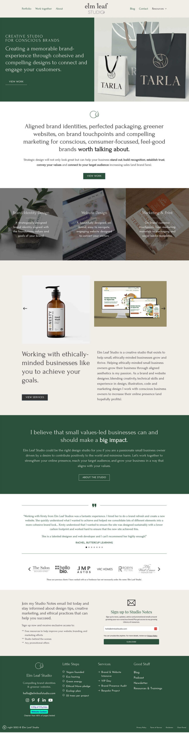
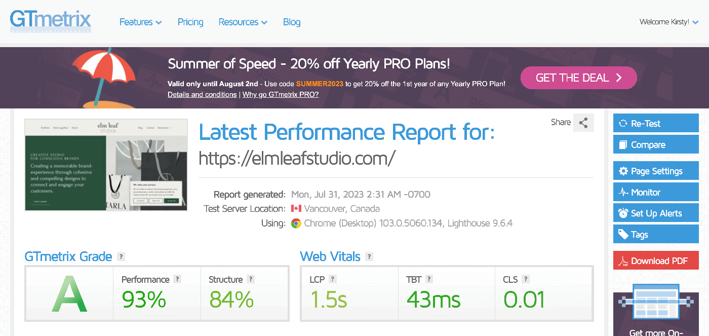
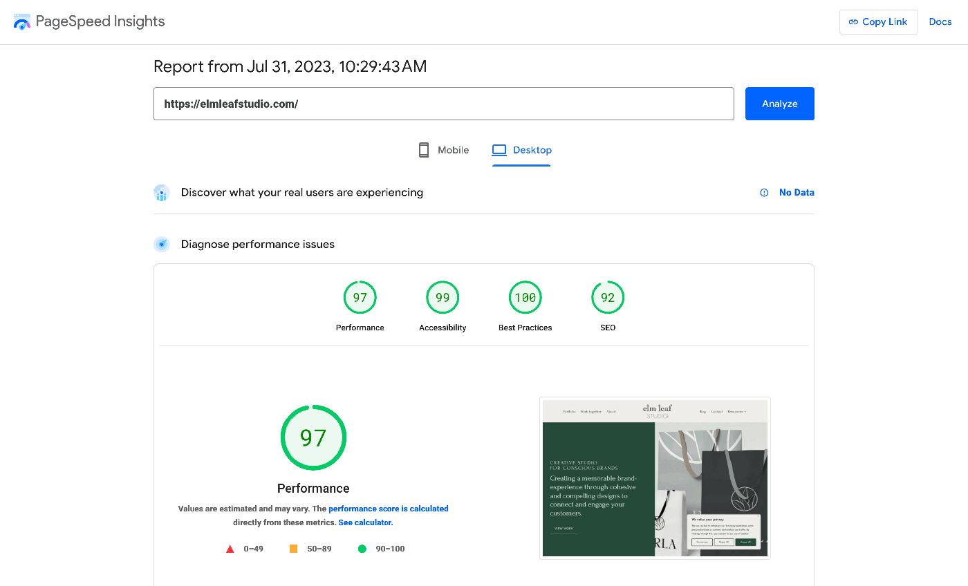
After – metrics showing improvements in key areas
Running the tests after showed some great improvements: websitecarbon calculator showed 0.3g of CO2 every visit, GT Metrix is grading the performance as a A / 93% and Google Page Speed Insights 97 for performance and 99 for accessibility.
Why these things matter:
Website speed optimisation
A faster website is best for both your visitors and your SEO (Search Engine Optimisation). Because if a site is slow to load people are typically going to leave your website affecting your bounce rate and time on page. If people are spending a good amount of time on your website from a search result this indicates to google that they served the right result and that your website is quality and what people are looking for to put it simply!
So how did I do this:
- I used Bricks Builder which is coded to be lightweight
- Audited and reduced plugin use
- Ran every image through TinyPng to compress them
- Ensure I only used the image size needed (eg. not huge dimensions when not necessary)
- Self hosted fonts rather than using google fonts to serve them
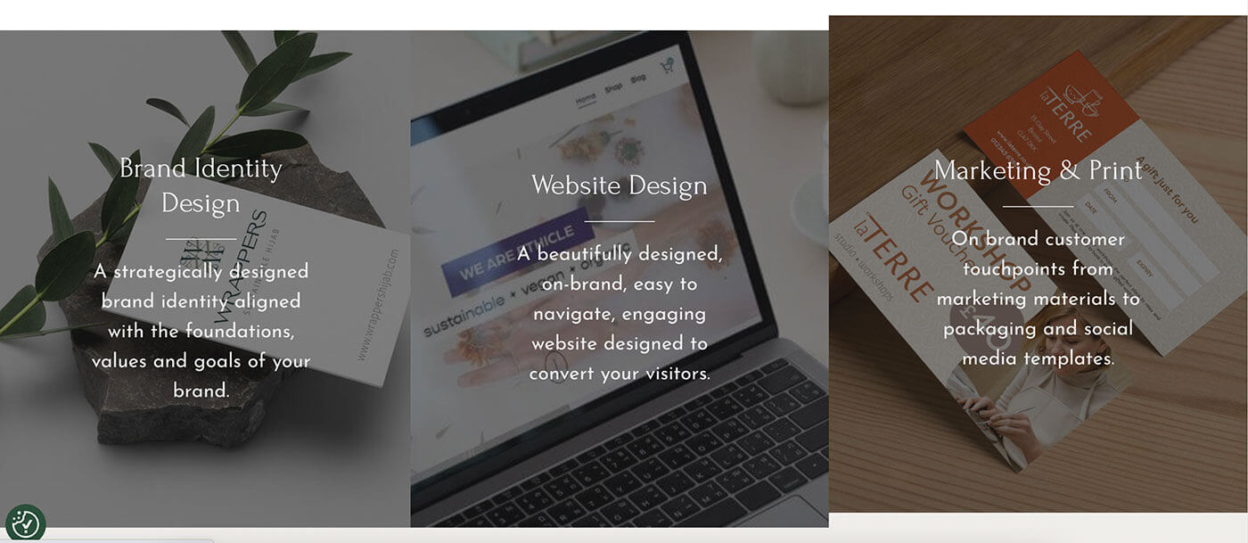
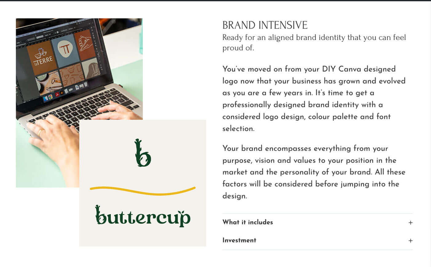
Website design improvements
The more engaging and easy to use a website is the more likely people are to stay on the website and convert. I worked on improving the navigation, layouts and adding extra flair with animation and giving more prominence to my core messaging.
- I used a mega menu design for the Resources tab as this could allow me to highlight my resources section as well as latest blog posts and direct people straight to what was piquing their interest (hopefully)
- My previous layouts were a little blocky and simple (nothing hugely wrong with that!) but I wanted to create pages that were more visually engaging such as image groups, better use of toggles, adding details such as timelines and tabs too to split content up. Another great way to add some visual interest is to create some movement which isn’t something I had done on my previous site, now some content has a hover effect or a slide in on scroll effect.
Accessibility
On my previous website I was using an accessibility overlay plugin in the aims of plugging the gaps across my website. However this is often reported as not the ideal way to do things and can actually cause problems to people who have access needs! So instead I wanted to incorporate best practices as much as I could to create a better website experience.
- I used Bricks Builder which has given thought to accessibility (like many themes it is not 100% perfect I’m sure) as well as an add-on that gives me some great starting points such as adding hidden text for accessibility too. This ensured things like an outline when using the keyboard to navigate for example.
- I made sure my website content had good contrast – although this is something I had already worked on previously
- I made sure to add alt tags to images where I had sometimes forgotten it
- Rather than using autoplaying content such as slideshows I’ve set this to be something that can be interacted with (or not)
What I would like you to take away from this is to consider the areas where you could make improvements to your websites performance – whether that be speed, time on site or conversions.
Of course you need to know what your website goals are and then it is helpful to audit how it is or isn’t meeting those goals. Some great tools to measure your websites performance are the ones I have screenshotted: website carbon calculator, page speed insights and GT Metrix.
I hope as well that it has shown some ideas that you could take to implement on your own website too.

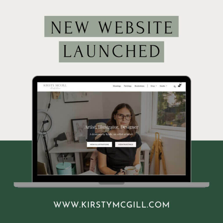
Hey, I’m Kirsty McGill the creative behind Elm Leaf Studio. I’ve been a designer for 13 years now and building websites for most of them.
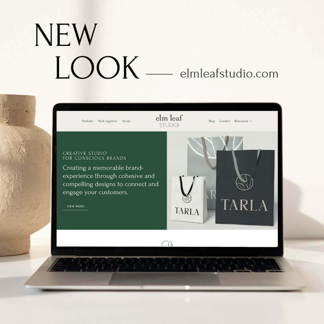
Elm Leaf Studio is a creative studio that exists to help small, ethically-minded businesses grow and thrive.
When I’m not designing I mostly spend my time running around after a toddler nowadays, and if I get a spare moment I enjoy reading, learning and making art.