
La Terre Pottery Lifestyle Brand Identity Design
Brand, Packaging, Marketing & Website Design
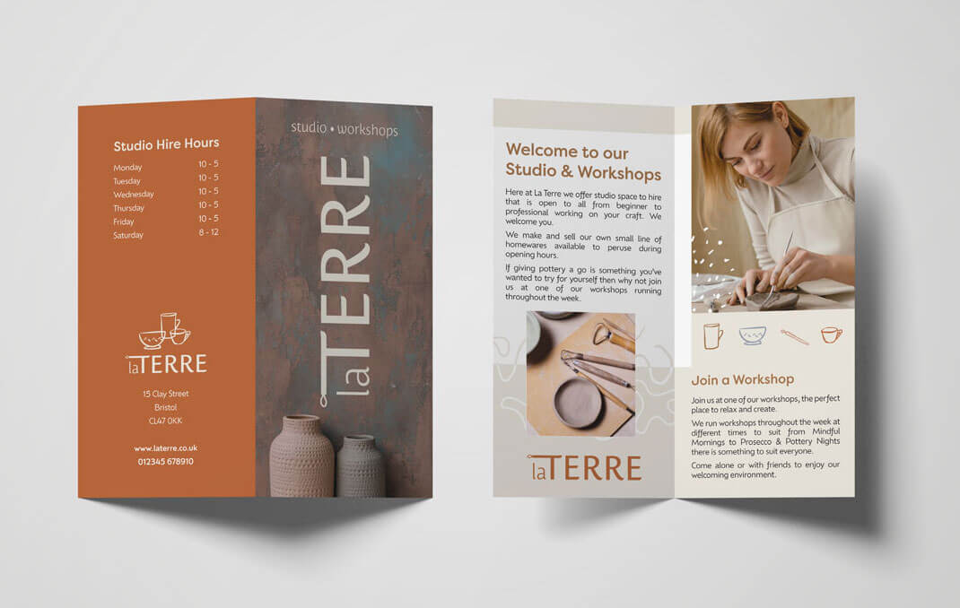
An earthy, warm and handmade feeling brand identity for ‘La Terre’ a pottery studio.
La Terre idea is from an Instagram logo brief challenge. The brief was for a pottery studio that offers a wide range of workshops that wanted ‘some earthy tones to be part of their brand to create a sense of warmth and unity, but don’t want their brand to look like every other pottery studio out there
- Logo design and brand design system
- Package box design
- Gift voucher design
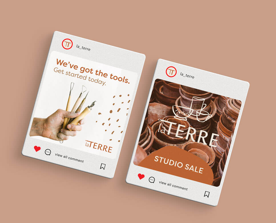
- Social media graphics


Project details & process
Choosing warm, earthy tones, rounded fonts for warmth, handdrawn illustrations and textures to create a custom brand identity that feels warm and friendly and is evocative of pottery. For the main logo I decided to not use the illustrated pottery items as felt this could be a common approach instead the T is altered to indicate a tool used in pottery. The secondary logo feature the icons and could be used in situations to quickly indicate it’s a pottery studio and where the space suits it. The rich terracotta colour is perfect as the primary colour with complimentary softer tones.
Looking for some compelling, commercially-focussed, on brand designs for your conscious brand?
Time to stop dreaming of an amazing brand experience for your customers – let’s make it happen!
