My aim with this project was to create a sleek and timeless brand identity that created a feeling of elegance and luxury without being stuffy, formal or traditional. A higher end product that doesn’t take itself too seriously either.
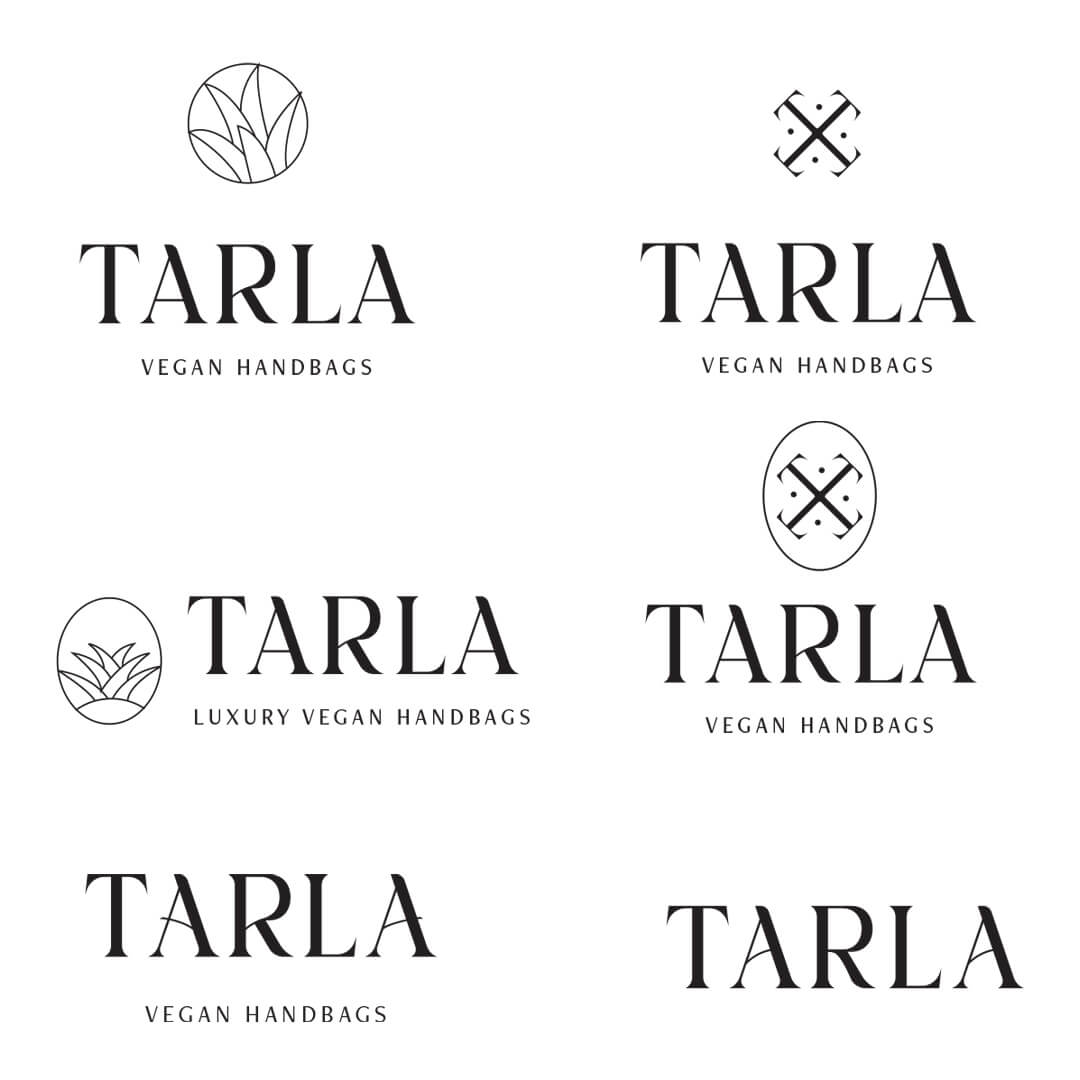
The concept was a vegan luxury handbag made from pineapple leather. So I used that element as a playful yet subtle aspect of the logo with the icon looking like the top part of a pineapple. I don’t think every logo needs an icon part but it can be really nice to include and this brand identity has a number of logo variations that would suit each application.
The manipulations of the font adds extra visual interest and a sense of personality whilst still retaining a premium look of a classic serif font.

Creative Direction
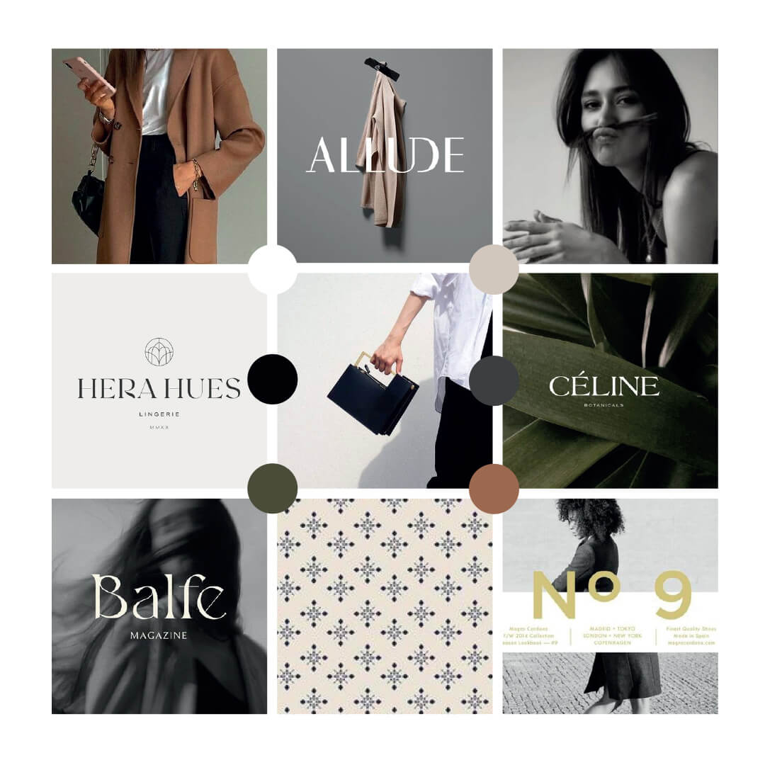
The first step of any brand identity project is research and creating a creative direction. On a client project this will be determined by the brand questionnaire and brand strategy. For this I collated various references using Pinterest and made a moodboard that informed the visual identity direction.
Typographic choices
The next step for me is usually sketching out various concepts, then I start sourcing different fonts that might be suitable to convey the brand (based on the creative direction stage).
For this project there were two logo concepts I was choosing from that used the T with a small hexagon that was subtly hinting at the skin part of a pineapple but I decided that this was a bit fresher and more modern.
A look behind the scenes at my logo development and how the brand identity evolves
Creating mock-ups and checking cohesiveness
An important step is creating mock-ups of how a brand identity is going to look in real life and to check that the brand system works. This is helpful for clients to be able to get a true sense of what their new brand identity could look like. A step that I like to do is lay it all out on a brand board with the different elements and mock-ups and colours to ensure that everything comes together well. Because it is so important that a brand has all the various touchpoints looking cohesive and ‘on brand’.
You can even see how I have chosen editorial style photos that have a little playfulness too, such as the hand holding the bag out or the model covering their face.
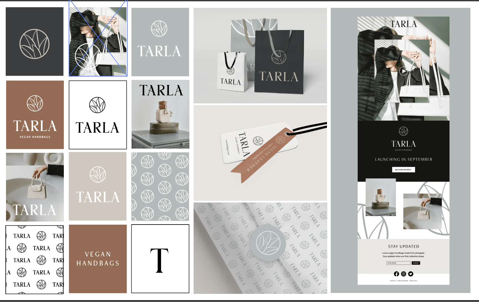
For the website mock-up I decided to focus on a pre-launch landing page design where the main focus would be creating a sense of excitement (the video), intrigue (minimal details but enough to evoke something) and to capture email addresses of potential customers.

Hey, I’m Kirsty McGill the creative behind Elm Leaf Studio. I’ve been a designer for 13 years now and building websites for most of them.
Elm Leaf Studio is a creative studio that exists to help small, ethically-minded businesses grow and thrive.
When I’m not designing I mostly spend my time running around after a toddler nowadays, and if I get a spare moment I enjoy reading, learning and making art.