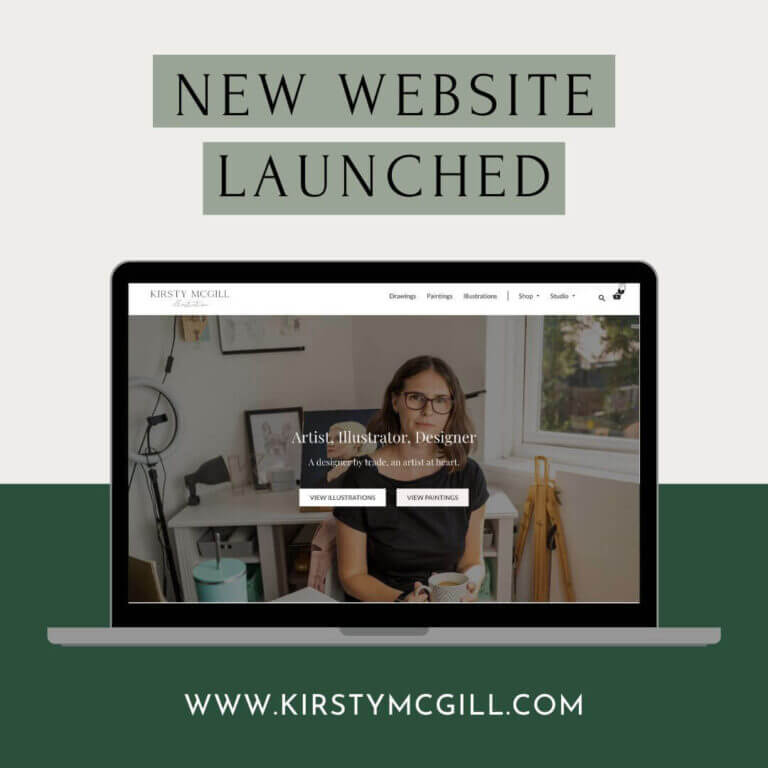
The new year is a good time to reflect and to plan for the year, plan out your goals, plan the steps that you’re going to take. It creates a natural time to reflect and figure out how you want things to look regarding your business. Now, one of the things that I suggest you do is to look at auditing your website now. We are going to look at the steps that go into a website audit.
Listen to this episode on Substack
Where to Listen:
Watch this episode on YouTube
Read it instead…
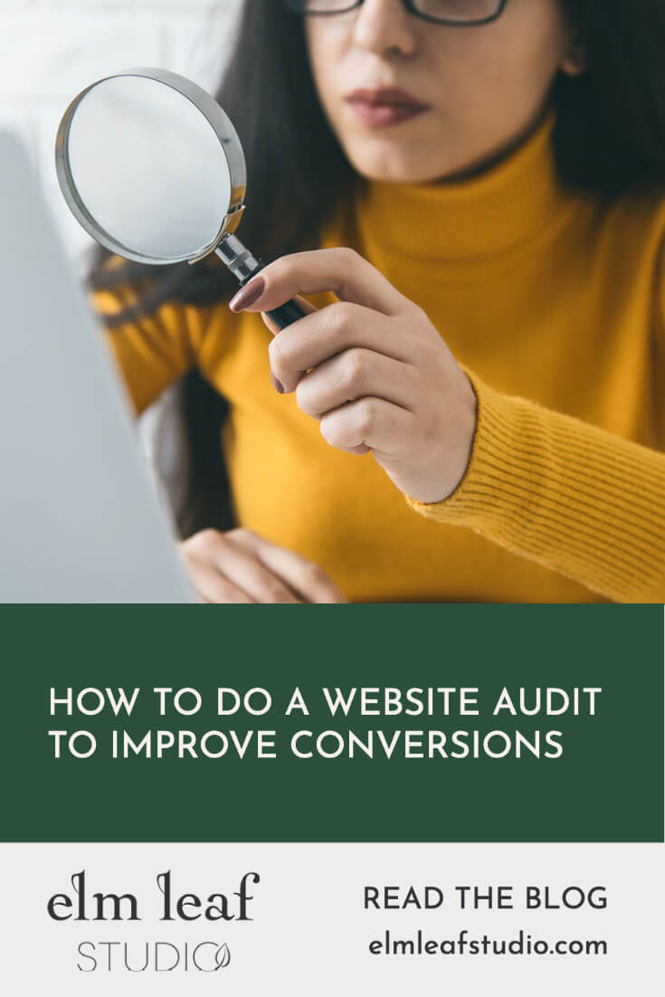
Why you should audit your website
It’s important to regularly, objectively review your brand and your marketing and your website. It can be quite hard to look at your own brand and business; it is easier to be objective when it is someone else’s.
I’m going to walk you through the things that I look at when I’m assessing someone’s website and auditing it. But if you’d like an expert eye on your stuff, then check out my audit service.
Your website is like a sales assistant. It’s your online home. It’s the shop and the sales assistant, really. When you run an online business or an e-commerce business, it’s so important to have your website looking right and working well. Not to have anything that could be putting customers off to stop them in their journey through your website. You want it to be converting, looking great and to feel on brand.
How to audit your website
step one: review menu navigation
One of the first things that a customer sees when they come to your website is your navigation, especially if we’re talking about the top menu in the header. This can look like having too many menu items which is confusing to look at, not having the right menu item or it might be that your submenus or mega menus aren’t set up very well. Or that you could benefit from using them.
Think about what the person coming to your websites is most likely looking for and how best to categorise that. Starting with around 6-8 top menu items and then what will sit under each of those menu items. For example a shop might have women’s, home and men and then underneath each of those, you could have a mega menu or sub menus that further break things down like t-shirts trousers etc.
step two: links on homepage
Of course, it’s not just your menu that people use to navigate your site. There will be various links throughout andways that people flow through your site. When I’m doing an audit, the next thing that I look at overall is the homepage and how easy that is to scroll down through and if it’s clear to what to click for where I should go next. Can I find what I’m looking for?
Now, especially if you are an e-commerce business, you need to be thinking about what you actually want people to go to next. This will most likely be a shop page or category. You also want to prioritise the categories that you want people to shop with perhaps your highest value products, most profitable or most loved etc. Make sure that those links are on the homepage.
Another point is to make sure that images link up so if you’ve got a picture that represents the category and underneath you have the category and maybe a button, you also need to make sure that the image itself links. Even just generally browsing the internet I see this and you go to click on that image and then it’s not working. Making it harder for people to use your website.
step three: footer links
Consider what needs to be in your footer, it can be helpful to add links that don’t make the top menu but visitors might need to see – this is a great place for things like the privacy policy contact, delivery and returns for e-commerce.
It’s where people will commonly know to look for them as well which is helpful for your customers. If you stick to the conventions with things like that, they know that they’re most likely going to be there and that’s where they will search for them when they’re looking for things like what the delivery will cost.
step four: branding
The first thing to say is to ensure that you were using your recognisable logo. Typically you want to use your main logo however, sometimes there is a case for using an alternate logo that will fit better if it makes more sense depending on the space available.
You need to be using your brand colours throughout, ensuring they’re consistent across everything from your marketing to your website. And of course fonts as well should be your on-brand font or a suitable web one. If you’re one isn’t available or you’ve chosen not to use that on your site for licensing cost reasons then choose a similar one. In your brand guidelines, if you have one that would be where a designer will often suggest an alternate font for when you can’t use your main brand fun.
Now, it’s not just those things that you typically think of as part of a brand identity either. Your website should have the feel that you want your brand to have it should be the right mood and and aesthetic. It needs to have images that are reflective of your brand as well to contribute to mood, look and feel.
step five: photography
If you are an e-commerce website, your product images should all be consistent, high quality, high resolution, brightly lit and clear. Don’t make them excessively larger than they need to be because you also want them to be small and load fast.
The way that your images are styled will also tell a story about your brand and convey it in a certain way. Is it minimalist? Is it luxury? Is it young? Is it for an older person? What else is in the image and what does that convey if you use other props?
step six: copywriting
Your copy needs to be written in a way that has your brand voice come through, in the messaging and the tone.
When you first start you end up writing a lot of copy yourself. If you can afford to work with a copywriter, then that is going to be so beneficial and for most designers they love if you can work with a copywriter first, because it really helps the website design too.
Maybe you could look at working with someone to edit your copy to polish it up as an alternative to hiring a copywriter to do it all.
When you are auditing your website, obviously have a look at if there’s any obvious spelling mistakes, but you can also just get a sense of whether the personality is coming across, if your messaging is what you wanted it to and does it sound how you want it to. Is it friendly? Is it professional? Is it light and casual, or is it a more serious tone with more authoritative elements? All of these things need to be considered, and you can see if you feel that the copy is conveying that.
Any calls to action should be clear and strong, showing what the next logical step is on your website.
step seven: shopping (e-commerce sites)
When I’m looking at a shop page, I always look for are there sufficient filters? This is really important, especially for bigger categories , or if you have quite a lot of products I think you need to consider having one’s like a price slider or scale size, availability, colour, collection, if it’s a broader category then maybe subcategories too. If you are a website that stocks multiple brands, people might come looking for a specific brand that they know you stock and you can help them by allowing them to choose to filter down to that specific brand.
I know most people have this, but definitely have that toggle that allows you to choose to sort by price and sort by popularity and things like that because people do look for it as it’s a helpful way to look through a page when they’re trying to narrow down what they want to purchase.
Moving on to a product page I do like to see a kind of a conventional layout for the most part here. It does depend on your website and it depends on your brand like most things. However if you stick with conventions, it’s how people know how to browse and kind of expect to see.
These design choices have been intentional and they work. If you think of a product page that has an image on the left, and then it has a bit of a short description on the right, probably with the selectors there, and an add to cart button in a nice prominent position for shopping. Extra details can be underneath that section. in a toggle perhaps, or in tabs because for some people they just wanna see the image and kind of get a sense of the product and they’ll be happy to purchase. Other people will want to maybe look at more details. You can make use of having links to things like style guides as well, or any extra details that they might need to know.
If you don’t already have this then having a row with related or recommended products is a really nice thing to have. It should show more items that that customer specifically is likely to be interested in. It’s not so helpful if it’s not relevant. Make sure that it’s something that’s generated and based on filters and categories to pull in other options for them. If they decide that that product isn’t for them, they can still keep shopping.
step eight: basket and checkout process (e-commerce sites)
Let’s look at it as though we are an e-commerce website. When someone’s clicked on the product, what happens next? Do they see that it has been added, does the basket show a little indicator to show that there’s some products gone in? if you click through to the basket, does that work as expected?
Does the basket page itself function as it should? Can they click through to go to checkout?
Check how the checkout process looks and works, is it easy to use? Are there any places where it might become harder. So sometimes when you are filling in your details and you click submit and it flags something and you can’t figure out what or you might want to look at making sure that people can enter their address easily with a postcode lookup.
Make sure that everything’s actually working and that’s definitely worth testing when doing an audit, especially if you notice an odd day where sales have been down or something, it’s always worth going to check that everything’s working.
for the service providers…
If you are a service provider, then this comes down to making sure your calls to actions are strong and obvious on a page so that invitation to click to inquire, you probably want to highlight it and check things like your forms are working, so that it’s easy for people to take that next step in the process.
step nine: assessing site speed
So far I’ve covered the kind of more visual aspects and the mood of the site and the feel of it, but your site also needs to be fast. And I did touch on this briefly when I said about the images, one thing that you can do is run it through something like Google Site speed checker to see how you are measuring up, and then you could look to make some improvements to you.
Make your website load faster because a slow site is going to really put people off. They might just completely jump off your site if it’s too. It’s been shown that people, if they land on a site and it’s taking a long time to load, they will just give up and go most likely. You don’t wanna be that site.
step ten: broken links
Another aspect you can look at when you are doing a order is to check for any broken links.
There’s some sites that you can use to do that. You don’t have to try and manually find them or anything, and I’ll put a link in the show note that you can go and use. Once you’ve found any broken links, make sure you fix them. [00:17:00] You can either do that by replacing it with a different link or redirecting. If that link no longer works if that link now needs to go to a different category, say you can set that up so that it just redirects and sorts that problem. because again, it’s a usability thing. You don’t want people trying to click on parts of your site that then don’t go anywhere or send them down a wrong path.
It all needs to, all needs to lead. Where it should. You want people to have the expected outcome from when they click on a button.
Would you like a professional website audit reviewing your online presence including social media?
If you would like a professional audit of not just your website, but your online presence, then my audit is a great first step to working together. Or of course you can take all my feedback and implement yourself or work with another designer too.
In Summary…
When you are looking at auditing your website, which you should be doing, you should look at things like your branding, your copy and content, how people will go through the website, check that there’s no broken links or things that will stop them in their flow of navigating. You should make sure that your categories make sense and have filters to make it easy for people to shop. If you are an e-commerce website then your product pages should have a clear layout, likely following kind of typical conventions, ensuring that the add to cart button is high up.
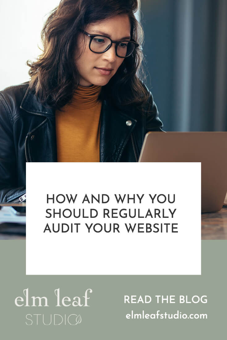
Your website is most likely evolving over time and it is important to audit every so often to ensure things are staying on track to help towards your business goals.
Let’s Connect:
Got some thoughts on this or want to connect on social media, Instagram is where you will find me!
Pin one to share or save for later!

Hey, I’m Kirsty McGill the creative behind Elm Leaf Studio. I’ve been a designer for 13 years now and building websites for most of them.
Elm Leaf Studio is a creative studio that exists to help small, ethically-minded businesses grow and thrive.
When I’m not designing I mostly spend my time running around after a toddler nowadays, and if I get a spare moment I enjoy reading, learning and making art.